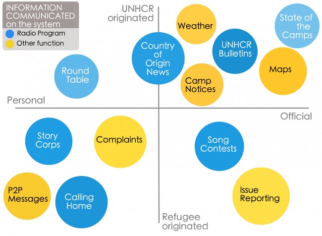
I made this 2×2 quadrant infographic for a presentation in my refugee redesign class — to capture the different radio programs (in blues) and miscellaneous communication functions (in yellows) that can occur on the system we are prototyping. The overall goal is to open better channels for the UN and refugees to exchange quality, reliable information in a refugee camp setting. It took a lot of restraint to keep me to grays, golds, and blues, but I’m happy with how it turned out.

A Refugee-UNHCR communication system

