![]() What about terms and conditions? I myself have never read one, but I’ve agreed to maybe fifties, maybe hundreds of them. A fellow U of Cer Aza Raskin (now of Mozilla) issued a call for designers to address just this. Why aren’t terms and conditions contracts readable, knowable, and near-instantly so?
What about terms and conditions? I myself have never read one, but I’ve agreed to maybe fifties, maybe hundreds of them. A fellow U of Cer Aza Raskin (now of Mozilla) issued a call for designers to address just this. Why aren’t terms and conditions contracts readable, knowable, and near-instantly so?
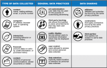
The challenge is to design some way — preferably in icons or a schematic of them– to communicate the stipulations that all those horrible ugly text paragraphs attempt to, so people know what they are doing when they click any Agree button — or even when they show up at a website that is quietly tracking them.
There have been a few responses so far — the icons above come from a UC Berkeley project Know Privacy. The Wall Street Journal has become a great center of documentation on breaches and protective measures for online privacy, replete with cartoon videos.
And at Carnegie Mellon they are devising a user-friendly guide to protecting oneself from phishing attacks (i.e., false solicitation of your personal details). Again, cartoons are the recourse of choice, this time a fish is involved.

